Review Pointer Target Size and Spacing on Lyric Video Controls
Measure the clickable area, then check its neighbors. A large-looking caption icon can still have a small activation area, while a small icon can sit inside a comfortably sized button. When choosing the best ai music generator for a lyric-video workflow, review the delivery player separately from the generated song. This guide gives you a blank geometry record and five fictional design exercises; it does not rank or test vendors.
Start with a small handoff record
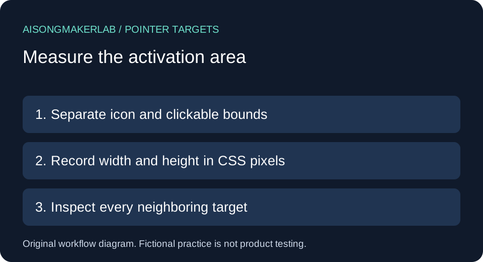
Save the page URL, player revision, layout state, control name, clickable width and height in CSS pixels, and neighboring controls. Keep measurements empty until someone actually inspects the implementation. Record the icon size separately from the activation area. A screenshot alone cannot establish where a click is accepted.
The W3C target-size minimum explanation describes a 24 by 24 CSS pixel baseline. It includes exceptions for spacing, an equivalent control on the same page, inline content, unmodified user-agent controls, and essential presentation. For undersized targets, its spacing method places a 24 CSS pixel diameter circle at each bounding-box center; those circles must not intersect another target or another undersized target's circle. Keep those qualifications attached to the rule. This focused review is not a whole-page accessibility certification.
A practical comparison sequence
- List actions the listener needs: play, pause, captions, language, volume and fullscreen. Identify the actual clickable region of each custom control.
- Inspect the layout you will ship, including open menus. Record CSS dimensions rather than inferring them from a scaled image.
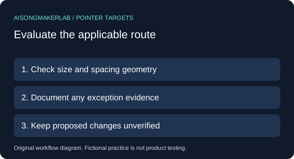
- For an undersized region, document the applicable exception and its evidence. If relying on spacing, include neighboring targets in the geometry check.
- Propose a larger activation region or clearer separation where practical. Check that expanded regions do not steal clicks from each other.
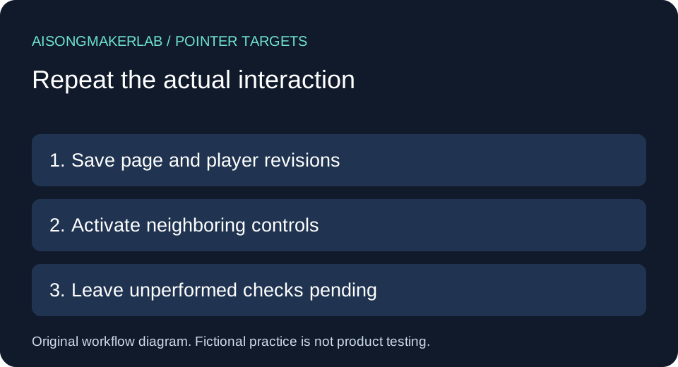
- Repeat activation checks after the change and record the result. Keep keyboard operation and focus checks as separate review tasks.
Five self-authored fictional cases
All five cases below are self-authored fictional design exercises. Names, layouts and dimensions are invented inputs for reasoning, not generated vendor results, customer quotations or measurements of any live player. Proposed fixes remain untested.
1. Two tiny caption buttons in a crowded toolbar
Fictional input: Mira builds a player with adjacent caption and translation buttons. Each clickable box is 18 by 18 CSS pixels, with centers 20 CSS pixels apart horizontally. The glyphs are crisp, so the design review initially concentrates on appearance. In this exercise, however, each activation area is smaller than the baseline in both dimensions.
Original reasoning: two centered circles with radius 12 have a combined radius of 24; centers only 20 apart make them overlap. That pair cannot use the spacing route described above. This is geometry on invented values, not a browser observation. The record should state the two region sizes, center distance and the route being evaluated, rather than merely saying that the buttons look small.
Proposed change: enlarge the clickable boxes to at least the baseline dimensions and lay them out without overlap. Keep the glyphs visually compact if needed. Pending check: activate both buttons around their edges in the revised layout and verify that neither triggers the neighboring action. Do not mark the proposal passed before that check.
2. Small language options with deliberate separation
Fictional input: Ellis uses two 20 by 20 CSS pixel language targets. Their centers are 32 CSS pixels apart on one row. The surrounding area is otherwise empty in the simplified drawing. The targets remain undersized even though they are more separated than Mira's buttons.
Original reasoning: the two 24-diameter circles do not intersect because 32 exceeds 24. That establishes only the circle-to-circle relationship in this invented pair. A real menu must also be checked for intersection with other targets, including a close button or a larger neighboring row. One favorable pair does not establish that the entire menu qualifies for the spacing exception.
Proposed change: consider full-width menu rows with comfortable activation areas to reduce dependence on narrow gaps. Pending check: inspect the expanded menu at the actual shipping width, map every neighboring target and record its geometry. Save a separate state if the language list wraps. Do not transfer the simplified drawing's conclusion to that changed arrangement.
3. A duplicate action with a larger control
Fictional input: Rowan places a small caption shortcut over the video and a larger caption control below it. The lower control is on the same page. In the design brief both controls toggle captions, but the implementation has not been reviewed. The shortcut is convenient while the lower control has an explicit label.
Original reasoning: the equivalent-control exception requires a qualifying alternative for the same function. A general settings button is not automatically equivalent just because it is large. The reviewer must establish what action the alternative actually makes available and that its target meets the criterion. Here the brief is an intention, so the worksheet should say equivalence is proposed, not confirmed.
Proposed change: retain the clear lower caption control and document the relationship. Pending check: use both paths to enable and disable the same caption track, verify their states stay synchronized, and inspect the lower control's actual clickable dimensions. If one path only opens an unrelated help page, revise the equivalence claim. Keep that functional finding separate from the size measurement.
4. A transcript link inside a sentence
Fictional input: Jules adds the sentence “Read the transcript for this song” below a player, with only the transcript phrase linked. A compact standalone download icon sits nearby. The mockup author wants to apply the inline exception to both because they share the same visual row.
Original reasoning: placement on one row does not make every control an inline text target. The sentence link has a different context from the independent icon. Record the sentence and its text flow, then examine the separate download control on its own. Do not extend an exception from one element to every neighbor in the surrounding container.
Proposed change: keep the meaningful sentence link, and give the standalone download action a clear activation area and label. Pending check: verify where each target begins and ends after layout changes. Confirm that selecting nearby text does not unexpectedly activate the download. A text-flow exception does not remove the practical value of making a link easy to recognize, nor does it replace the separate keyboard review.
5. Browser controls replaced by custom artwork
Fictional input: Devon begins with unmodified browser-supplied video controls. Later, a designer draws a custom toolbar over the player and hides the original controls. The project note still says that all controls use the user-agent exception because the media element itself is native HTML.
Original reasoning: the relevant question is who determines the target size and whether the author modified it. A native media element underneath a custom toolbar does not establish that the custom targets are browser-determined. The review record should identify the actual visible control implementation in each revision, rather than carrying an old exception forward indefinitely.
Proposed change: split the record into the original browser-controls revision and the new custom-controls revision. Leave the former's browser-dependent details recorded as such; measure the latter's activation areas. Pending check: confirm which controls are exposed in the delivered page, then review their sizes, neighbors and actions. Do not describe an uninspected browser control as measured, or call custom styling exempt solely because playback uses a standard video element.
Keep the comparison reviewable
Use the blank CSV to record facts and pending checks separately. Suggested dispositions are “measured,” “exception evidence pending,” and “change proposed.” Attach the page revision so a later toolbar redesign does not silently inherit an earlier conclusion. The fictional-case download preserves the reasoning inputs for practice; it is not a product benchmark.
The W3C media-player planning guide provides broader player-selection context. Our worksheet narrows the task to pointer targets. A control that is easy to click can still need work in other interaction modes.
Frequently asked questions
Does a large caption icon prove a large target?
No. Inspect the activation region. Artwork and clickable bounds can differ.
Does every small target automatically fail?
No. Evaluate the applicable conditions and exceptions in the linked W3C guidance, with evidence for the actual control.
Can I use physical screen pixels as the measurement?
Use CSS pixels for this review. Record the layout context rather than deriving a value from a resized image.
Does this replace the keyboard walkthrough?
No. Keep reaching, operating and identifying focused controls in their own review records.
Were these cases run against music generators?
No. They are fictional authored exercises with proposed checks. No vendor output, user success rate or observed repair result is claimed.
Download the five fictional cases · Download a blank review CSV