Keep Lyric Video Text Readable When the Background Changes

Give the words a stable background before you change the font. For a lyric video with moving imagery, an opaque caption panel makes the text/background pair predictable. Check the chosen colors, inspect the final small-screen export, and review every background transition. One readable preview frame does not establish readability throughout a song.
Choosing the best AI music generator does not finish the display work. This guide addresses the video you assemble afterward. All five cases below are self-authored fictional exercises with declared solid colors, not generated vendor results, customer stories, or tests of any music service. The downloadable calculation checks those declared colors only.
Start with a bounded check
The W3C contrast reference gives 4.5:1 for normal text and 3:1 for qualifying large text. Use the normal-text threshold for these exercises. Do not assume a large editing-canvas font remains large when a video is reduced on a phone. These ratios do not certify an entire video, its timing, its captions, or its accessibility.
Our calculator converts each sRGB channel to linear light, combines the channels into relative luminance, and divides the lighter luminance plus 0.05 by the darker luminance plus 0.05. Keep the unrounded result for the threshold decision. The displayed two-decimal number is a convenience, not permission to round a near miss into a pass. Photographs, transparency, outlines and compression require additional inspection of actual rendered pixels.
Five original fictional caption exercises
1. A pale sky hides a white lyric
The fictional line is “Carry the morning home.” Put white text (#FFFFFF) over a solid pale sky (#EEEEEE). The words remain present in the source file, yet the pair provides only about 1.16:1 contrast in our declared-color calculation. Making the same letters wider does not change that calculated ratio. Do not report the text as readable merely because the editor still contains every word.
For the revision, keep the white letters and place a fully opaque #111111 panel beneath the complete line, including its padding. The new declared pair is about 18.88:1. The panel must extend under every glyph; a short box that ends before “home” leaves part of the task unresolved. Save both color pairs in the record, then inspect the actual exported frame. This exercise demonstrates a controlled color substitution, not a measurement of a sky photograph or proof that every viewer can read the line.
2. A dark scene swallows dark letters
The fictional line is “We wait beside the station.” Our starting colors are #222222 letters and a #333333 background. Their calculated contrast is about 1.26:1. The scene name does not matter to the computation: it only receives those two flat colors. A bright decoration elsewhere on the card does not improve the pair immediately behind the lyric.
For this version, keep the dark letters and use an opaque white panel. The revised pair is about 15.91:1. This is a different editorial choice from turning every caption white, and it lets a dark-text design survive a dark scene. Keep enough padding that descenders and punctuation stay inside the panel. In the record, write “declared solid-color pair checked” and leave “export inspected” pending until you have actually viewed the file. The calculator cannot tell whether the editor cropped the panel or substituted a different text style.
3. The next frame reverses the result
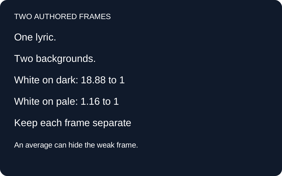
The fictional refrain is “Keep one light for me.” White text begins on #111111 and then continues across a cut to #EEEEEE. The first declared frame gives about 18.88:1, while the second gives about 1.16:1. Averaging those values would hide the weak frame. Record the two frames separately and keep the lower value visible as the unresolved condition.
Place the same opaque #111111 panel behind the words on both frames. Both declared pairs now calculate to about 18.88:1. This stabilizes the example even though the background outside the panel changes. It does not prove there are only two backgrounds in a real transition. A dissolve can create intermediate states, and a moving caption can leave its panel. Inspect the actual transition as well as the endpoints. Retain the timestamp or frame identifier for each observation so another editor can return to the same place instead of guessing which preview you approved.
4. A translucent box is a different experiment
The fictional line is “Mara leaves a lantern burning.” In this case the design decision is a white lyric on an opaque #111111 panel, again about 18.88:1. That result belongs to a panel with no transparency. If the editor later lowers panel opacity, the saved ratio no longer describes the displayed background. A color swatch in a style inspector is insufficient evidence for the blended result.
Keep an explicit “opaque” field in the handoff record. If translucency is required, capture the rendered background beneath the letters at the relevant frames and treat those samples as a new check. Do not reuse the opaque result under a changed setting. Our downloadable cases intentionally do not model alpha compositing, gradients, shadows or antialiased edges. The useful outcome here is knowing when the calculation stops applying. Approval of the solid panel is narrow; it should not silently approve a different visual treatment just because the words and hex color label stayed the same.
5. A large canvas becomes a small display
The fictional line is “Bring the river song home.” Use #777777 letters on white. This pair calculates to about 4.48:1: below the 4.5:1 normal-text threshold. It is above 3:1, but that alone is not a reason to accept it as large text. A large preview on your monitor does not establish the final display size on a viewer’s phone.
For a simple revision, darken the text to #666666 while keeping white behind it. The declared contrast rises to about 5.74:1. Then inspect the final displayed text for size, clipping and readable line length. The revised color calculation does not measure any of those properties. Keep separate fields for color-pair result and small-screen inspection. This separation prevents a successful arithmetic check from being mistaken for a successful viewing session. No device test is claimed by this fictional example; an editor still needs to open the actual exported video at the intended display size.
A reusable display record
Record the approved lyric revision, foreground, effective background, panel opacity, frame or timestamp, unrounded calculated ratio, threshold used, and actual export inspection. Keep a separate unresolved field for moving backgrounds and display size. Recheck the record whenever the style, scene or export changes. A sampled frame is evidence for that frame, not every frame in the file.
Questions before export
Does a drop shadow replace a panel?
Not in this exercise. The calculator knows only two flat colors. A shadow requires inspecting the actual edges and background; its presence alone is not a recorded result.
Can I average contrast across the song?
Do not use an average to clear a weak passage. Keep the troublesome frame and its location visible so you can fix and revisit it.
Is a matching lyric transcript enough?
No. An unchanged transcript addresses word preservation. Readability and timing need their own observations against the actual exported video.
Does this prove a vendor makes accessible videos?
No vendor video was generated or measured. These are authored color exercises and a local calculation, with explicit limits.
What should remain pending without an export?
Actual visual readability, movement, clipping and timing remain pending. You can save the intended style and calculated pair without claiming those later checks passed.
Declared cases and calculated results · Reproduce the color calculation · Blank inspection record
Sources read 2 November 2026: W3C contrast reference for thresholds and the luminance method; OpenMusic video page for a workflow research lead. Its format choices, showcase and FAQ structure informed our task routing. No product generation test or copied showcase content is used.