Keep Keyboard Focus Visible on Lyric Video Controls
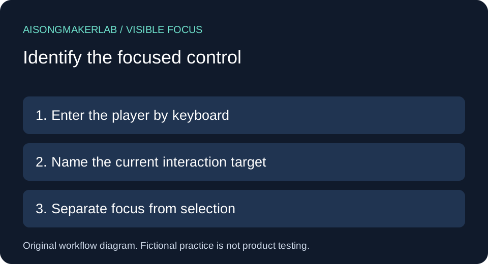
Give every keyboard-focused player control an identifiable visual state, and keep that state visible until focus moves. Check play, captions, menus and fullscreen transitions over the actual video background. Reaching a button and recognizing which button is ready to act are separate review questions.
Choosing the best ai music generator includes planning how listeners will use the delivered video. This guide concerns the player interface around your song, not music quality. It supplies a manual review record and five self-authored fictional cases; no vendor player was tested for these examples.
Start with a small handoff record
Save the delivery URL, player version, control name, keyboard entry path, background state, expected indicator, actual observation and next action. Keep unperformed checks pending. A design proposal is not a successful observation.
The W3C explanation of Focus Visible describes a keyboard operating mode with visible focus and explains that the indicator must persist while focused. It does not prescribe one universal outline shape. Contrast and focus appearance have related requirements; this worksheet is not a complete accessibility assessment.
A practical comparison sequence
- Enter the player by keyboard and name the focused control before activating it.
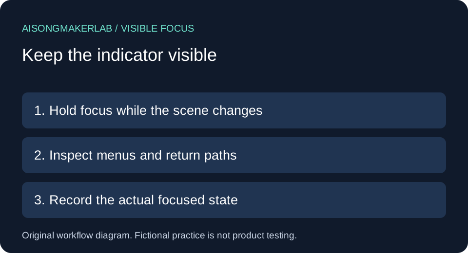
- Keep focus in place while the scene changes. Record a reproducible background and player state where identification becomes difficult.
- Open the caption menu and distinguish the selected language from the currently focused option.
- Leave the player and return. Record the actual focus destination after each transition.
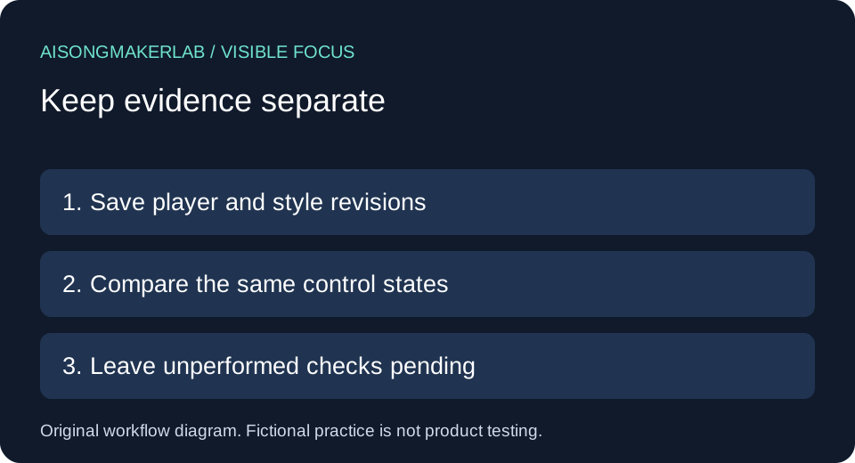
- Repeat after a proposed repair, using the same path and state. Save observations separately from the repair description.
Five self-authored fictional cases
These are authored design exercises with invented players and scenes. They are not generated vendor results, customer quotations, measurements or reports of real failures. Each proposed change still requires inspection in the destination player.
1. The focus mark blends into a video frame
Fictional setup: Mira's lyric preview places a thin pale play-button outline over a snowy station scene. The control is easy to identify in the opening dark frame. In the imagined later frame, the same pale boundary becomes difficult to distinguish. The selected lyric revision and the rendered scene remain unchanged in this exercise.
Decision: Record both background states instead of approving the control from its initial appearance. Propose a stable backing behind the controls or a focus treatment that remains identifiable across the relevant backgrounds. Do not fix the problem by changing the approved lyric text or moving the song's meaningful imagery without review.
Review record: Control: play. Entry: Tab from the preceding link. Comparison states: dark opening and snowy station. Expected: the focused control remains recognizable in both. Observation: pending actual player inspection. Preserve a scene identifier or time location so another reviewer can repeat the check. A single favorable frame cannot establish the behavior throughout the video.
2. The indicator disappears before activation
Fictional setup: Rowan's custom preview briefly lights the pause button when focus arrives, then fades the highlight while focus stays there. The imagined viewer pauses to read a line before deciding what to do. The button remains in the tab sequence, but its momentary entrance animation no longer shows the current interaction point.
Decision: Treat the entrance animation and persistent focused state as separate design elements. Keep a stable visible indicator for the duration of focus. An animation can supplement that state, but should not be its only visual evidence. Avoid substituting a hover effect, since a keyboard user may never place a pointer over the control.
Review record: Save the entry path, the retained focus target and the state after waiting without moving focus. The proposed repair is persistent styling; its outcome remains unverified until checked. Record the actual duration if testing later requires it, rather than inventing a threshold or claiming this fictional exercise measured one. Activation success alone would not resolve the disappearing indicator.
3. A caption menu confuses selection with focus
Fictional setup: Ellis opens a language menu where English is selected. A check mark indicates that selection. Keyboard focus then moves to Spanish, but the imagined interface offers no separate focused treatment. A reviewer looking only for the check mark could mistake the current caption setting for the option that the next activation will choose.
Decision: Give selection and keyboard focus distinguishable meanings in the interface. Preserve the selected-language marker while making the currently focused option recognizable. Follow the menu's documented interaction model; do not assume every control uses Tab between its options. Record whichever keys the actual player supports.
Review record: Save selected track, focused option, movement key and the expected result of activation. Before activation, a reviewer should be able to identify the pending target. After activation, check the selection and focus again as separate observations. This exercise proposes a distinction; it does not establish that any named player implements it or that every viewer can interpret the chosen styling.
4. A custom play control loses the default outline
Fictional setup: Nia replaces a plain play button with a branded triangular icon. A style rule removes its outline. In the invented design, the pointer hover state changes color, yet keyboard focus produces no visible change. The triangle still looks like a play control, which can distract a reviewer from asking whether it currently has focus.
Decision: Retain the platform's useful focus treatment or provide a visible replacement. Review the focused state through keyboard entry, rather than judging a static mockup or pointer hover. Also keep the button's accessible name and operation in the broader review; adding an outline alone cannot establish that those separate properties work.
Review record: Identify the custom control, the style revision and the route into focus. State what visible feature is expected to distinguish focused from unfocused. Leave the observed difference blank until the real interface is inspected. If a repair changes shared styles, check the other affected controls too. A local design proposal should not silently become a claim about the whole site.
5. Returning from fullscreen leaves an unclear position
Fictional setup: Theo enters fullscreen from the player, then exits to the lyric page. The imagined page has several nearby controls. The viewer cannot tell which one is ready for the next keyboard action. Two explanations remain possible in the exercise: focus moved somewhere unexpected, or focus returned appropriately but its indicator is absent.
Decision: Investigate destination and appearance separately. Record the focused element after exit, then inspect its visible state. Do not immediately restyle the fullscreen button if the actual focus destination is elsewhere. Likewise, correcting the return destination does not prove that its indicator is identifiable.
Review record: Save the entry control, exit method, resulting focused element and next keyboard action. Compare the return path with ordinary navigation into the same control. Keep actual and expected destinations in separate fields. This separates two repair hypotheses without claiming a universal browser behavior. The fictional case remains pending until a reviewer repeats it on the specific player and delivery page.
Keep the comparison reviewable
Use one row per control and state. A useful note reads: expected persistent boundary; actual observation pending; next check is keyboard entry with the named scene active. A vague note such as accessible or fixed cannot show what was reviewed. Preserve the original record after a repair and append a new observation with the new revision.
The existing keyboard operation guide covers reaching and operating controls. Use this companion for recognizing focus while it remains on a control. Neither replaces a complete player review.
Frequently asked questions
Does a working Tab key prove focus is visible?
No. Reaching a control and visually identifying it are separate observations. Record both.
Must every control have the same rectangular outline?
No single shape is prescribed by the cited Focus Visible explanation. The focused state must remain identifiable; further contrast and appearance requirements need their own assessment.
Can I use the hover color as the focus style?
A similar appearance may be useful, but verify that keyboard focus actually triggers an identifiable state. Pointer hover alone is insufficient evidence.
Is a selected caption language the focused option?
Not necessarily. Selection describes the active setting; focus describes the current keyboard target. Review them separately.
Does this worksheet certify a player?
No. It is a limited manual record with fictional examples. Actual observations, other accessibility requirements and the destination environment remain separate work.
Download the five fictional cases · Download a blank review CSV